michavila
valencia
2016
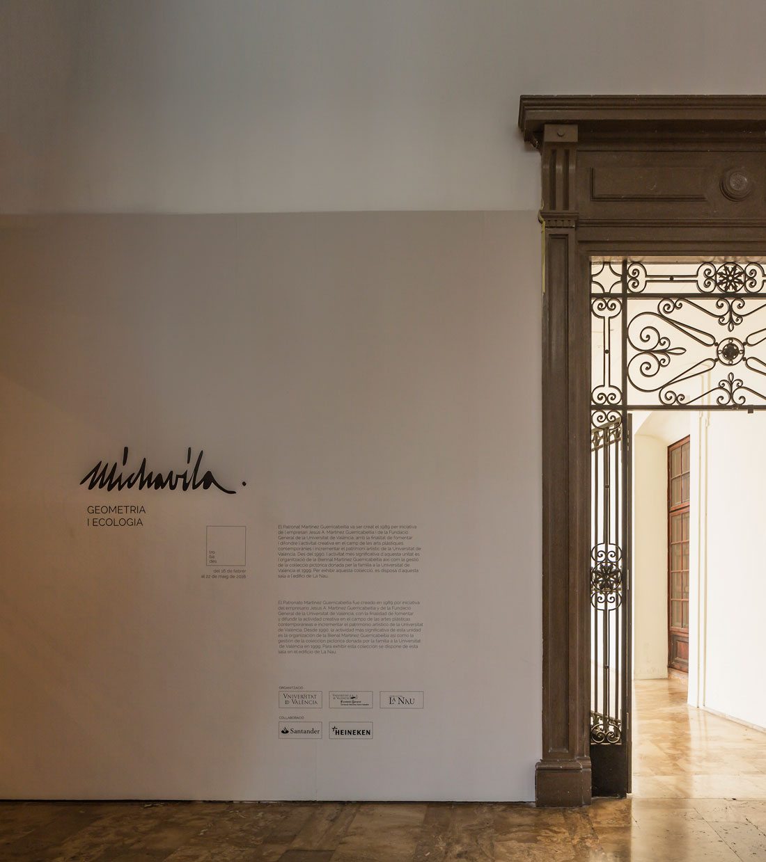
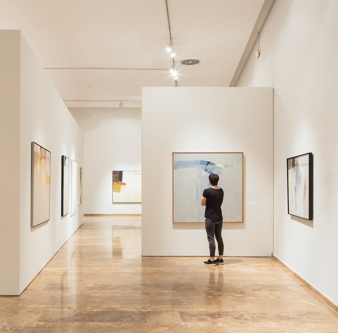
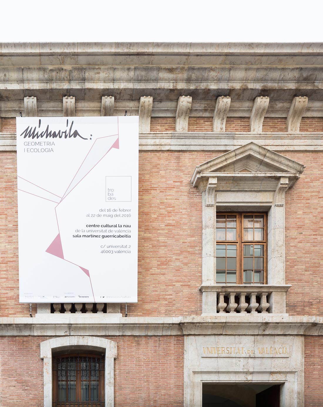
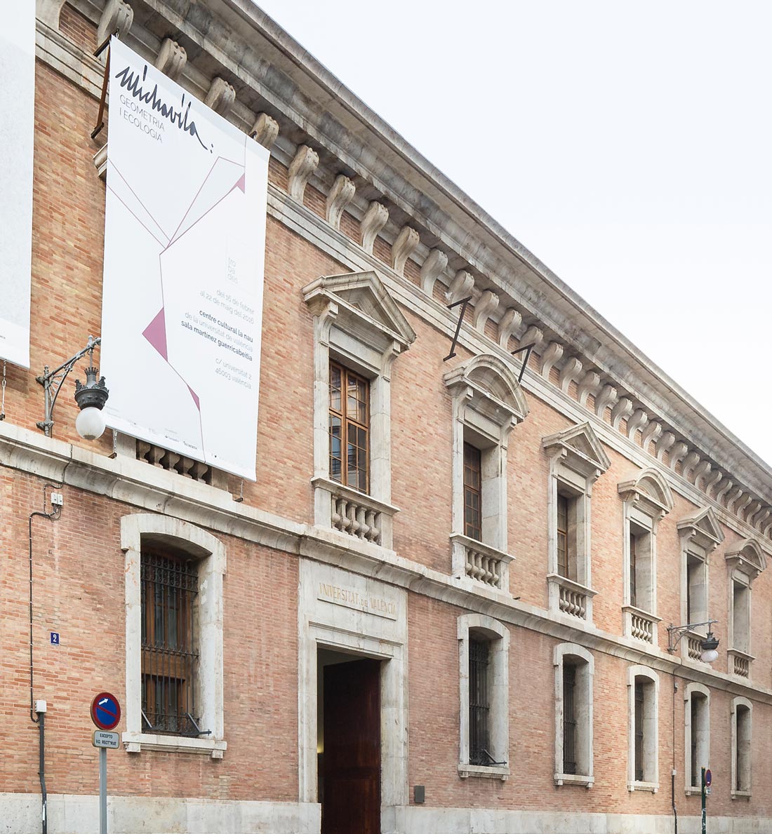
the martínez guerricabeitia on the agenda of annual exhibitions, instructs us the design and layout of the different elements of the exhibition “michavila: geometry i ecology”
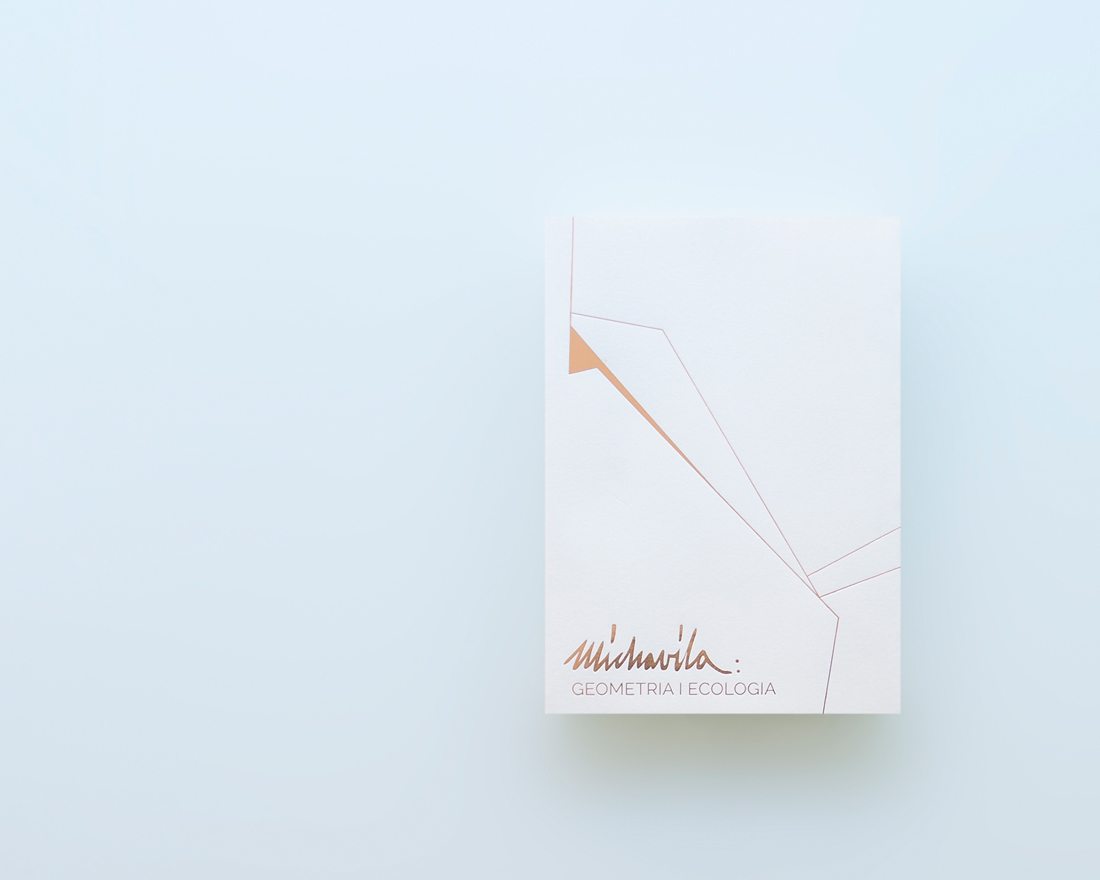
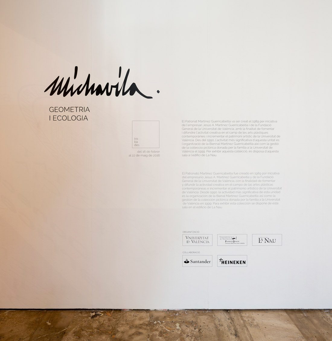
either for the catalog and for the various communication elements of the exhibition, two resources, that serve as a common denominator are used. first, the signature of joaquin michavila, as differentiated and differentiating element that identifies the title and the tittle of the exhibition. the second resource is the geometry and color, taking the artist’s work as a reference a pictoric element with lines and planes is used to allow compose and organize various resources (titles, logos, etc.) that appear in both the catalog and in different communication elements. this resource, is painted with a typical color that michavila used to work with in many of the landscapes he painted as “the albufera”. in order to optimize costs, printing is made either by a stamping with a metallic pink, or with a metallic pantone, both of the same color.
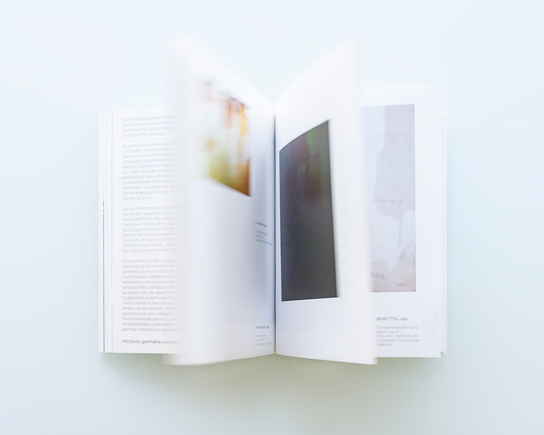
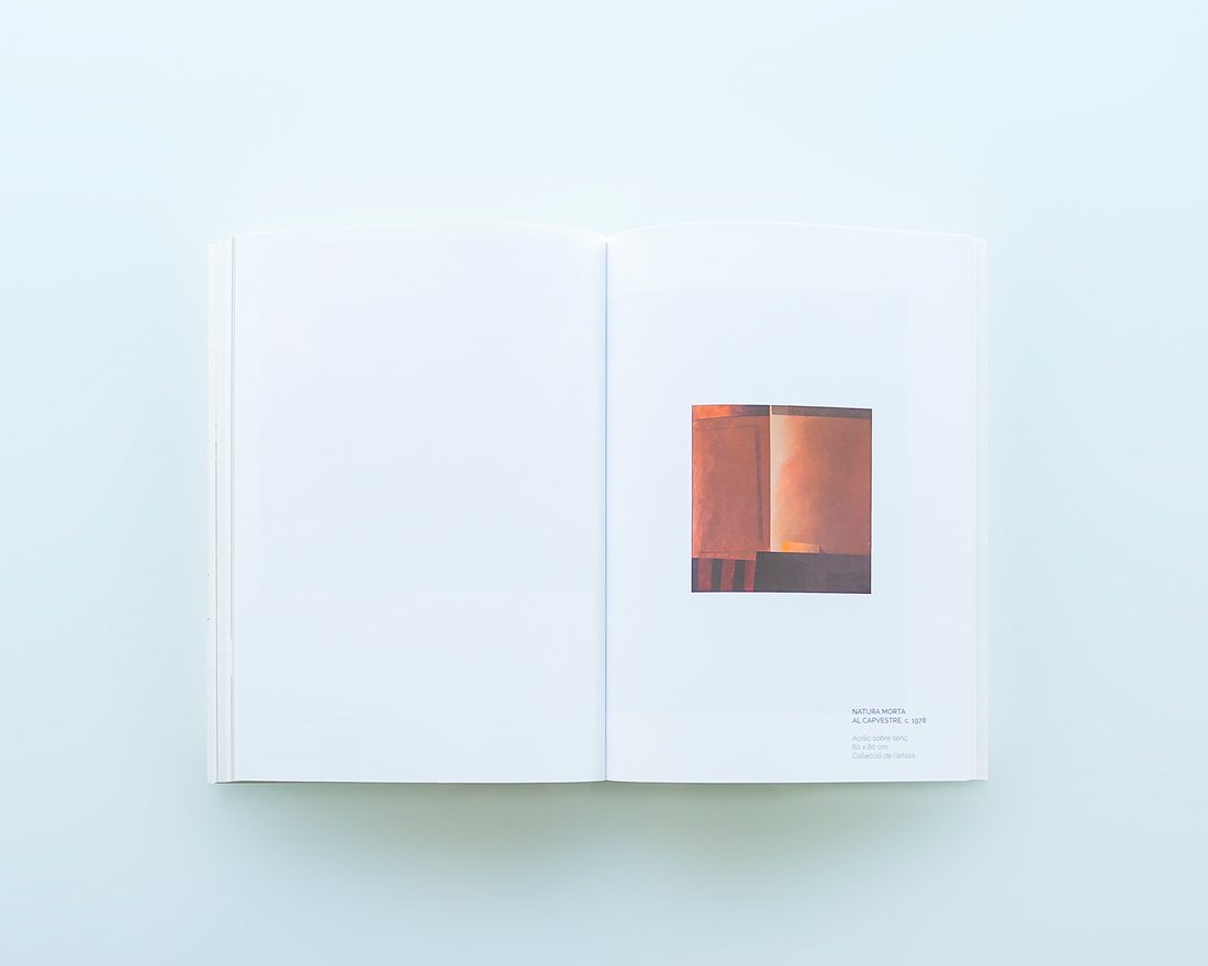
such eagerness to optimize and rationalize costs moved to the type of printing, using two types of paper, an offset to the sheets that contain only text and are printed in monochrome; and a coated paper suitable for printed images.
client colección martínez guerricabeitia
exhibition design, branding, graphic design
photos by daniel rueda cuerda